Timeless Typography Reimagined
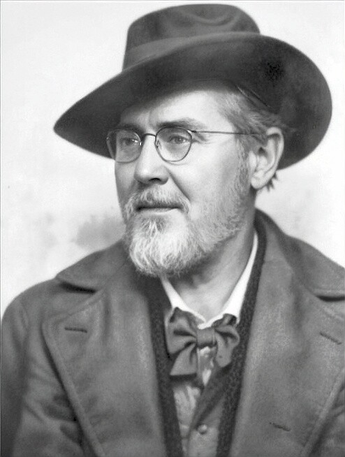
When it comes to vintage typography, few names carry the quiet distinction of Professor Wilhelm Krause. Active in the early 20th century, Krause was a renowned German typographer and professor at the Kunstgewerbeschule in Breslau (today Wrocław, Poland). Known for his masterful teaching in lettering, calligraphy, and design, he left a lasting impact on the world of type design.

In 1930, Krause published his most famous work, the Professor-Krause-Fraktur, through the prestigious Ludwig Wagner Type Foundry in Leipzig. This beautiful blackletter typeface, designed in seven different styles, became a symbol of elegance and German craftsmanship. It combined historical authenticity with practical versatility, making it widely popular for books, advertising, and fine print. His designs reflected the artistry of centuries-old traditions, yet were perfectly adapted to the needs of his time.
Today, the influence of Professor Krause continues to inspire designers around the world. His work is celebrated for its intricate detail, balanced form, and unmistakable historic character. His fonts bring the sophistication of 19th-century Germany into the modern digital world, offering a rare blend of heritage and usability.
The Lettering Works of Professor Wilhelm Krause
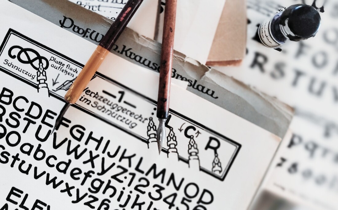
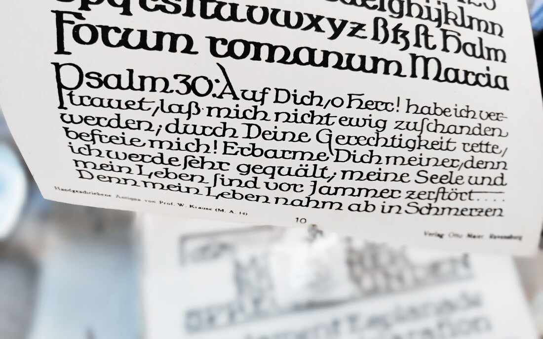
In addition to type design, Professor Krause created a series of extraordinary hand-drawn lettering specimens that showcase his artistic range and technical mastery. These handwritten works reflect the variety of calligraphic traditions he taught – from Gothic Fraktur to Antiqua and script-style alphabets.
His calligraphy collections, now considered typographic treasures, include:
- Elegant Fraktur Scripts: Perfectly balanced blackletter designs, steeped in tradition but full of creative energy.
- Hand-Drawn Antiqua Alphabets: Early sans-serif and serif styles, carefully shaped for clarity and flow.
- Roman & Decorative Scripts: Classical Roman capitals combined with playful, lively handwritten texts.
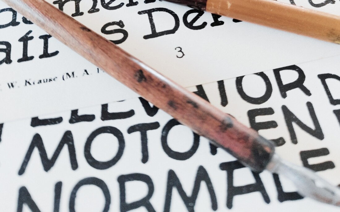
- Technical Lettering Examples: Instructional layouts demonstrating pen control, spacing, and historical styles.
These original works, created with traditional ink and dip pens, were used both as teaching aids and as artistic demonstrations of high-quality letter construction. They embody the ideal of the “writing hand” that preceded mechanical typesetting – where every curve, serif, and stroke was intentional and expressive.
Today, they serve as an invaluable resource for calligraphers, typographers, and designers, offering insight into historical writing practices and providing authentic inspiration for anyone seeking to recreate the spirit of true hand-drawn lettering.
Soon Available: Professor Krause’s Handwritten Fonts
We are currently working on digitizing and adapting Professor Krause’s original handwritten alphabets into modern fonts, so you can bring this incredible craftsmanship into your own projects. Stay tuned for the release of these unique typefaces — crafted from history, made for today.
Portrait of Professor Wilhelm Krause was digitally enhanced, based on a historical photograph published in https://www.klingspor-museum.de/ Enhanced with AI due to the poor quality of the original source.


